This topic has been on the team's weekly agenda for three months running. "Should we update the theme?" Same conversation every week, same conclusion: let's revisit next quarter, not a great moment right now because of the campaign. And the following Wednesday, it's right back on the list.
Sound familiar? The reason it doesn't move forward is usually that the question is too big. "Should we update?" isn't a yes-or-no decision. It's shorthand for several decisions that need to be unpacked separately.
Walk through these questions with the team:
Why haven't we updated the theme in a long time? Technical blocker, fear of risk, or just never prioritized?
How much custom code actually sits on top of our theme? Does anyone know exactly?
When the designer proposes changes, how often is the answer "the theme doesn't support that"?
Are PDP or checkout conversion numbers showing signals that the problem is in the theme — or somewhere else?
Is a theme investment the best use of this budget, or should the same money go into media or retention?
Once you've answered these, the decision usually becomes clear — but the conclusion isn't necessarily where the conversation started. Sometimes an update is the right answer. Sometimes it's replacing the standard theme entirely with a custom build. And surprisingly often the right answer is "not yet."
This guide walks through those questions with one difference compared to most: we look at the theme as part of the entire customer journey. A storefront converts (or doesn't) based on how the theme, content, advertising, and checkout play together. So a theme decision can't be made in isolation from CRO.
What "standard Shopify theme" means in 2026
Shopify has never sat still on theme architecture. Roughly every two to three years they raise the bar: Timber (2014), Slate (2017), Debut (2017), Dawn (2021), and now Horizon (2025). Horizon is the strongest standard theme Shopify has ever shipped — block-first architecture, AI-assisted section generation, features that previously required a premium theme.
But here's the pattern that decides things. Every time Shopify ships a new standard, brands that customized the previous one face a painful transition. If you spent 18 months layering custom code on Dawn, moving to Horizon means starting that work over. The fundamental constraint stays the same: the moment you add custom code to a standard theme, you lose the ability to cleanly accept updates.
The moment you customize a standard theme, you start drifting away from the platform it was built on.
When a standard theme is the right call
Don't go custom if:
Your brand doesn't require a visual identity beyond what a theme provides
There are no roadmap features that can't be handled by apps
Revenue is below roughly €5M
If most of these describe your situation, a standard theme is probably the right call. Don't let anyone upsell you. An agency recommending a custom build for a €2M brand with a simple catalog is optimizing for their invoice — not your business.
Five signals you've outgrown your theme
1. You can't update your theme anymore. Accepting an update means rolling back all custom changes, applying the update, and re-implementing the changes one by one. After the first failed attempt, your team stopped trying. You're now running a theme two versions behind.
2. Developers spend more time reading code than writing it. A standard theme is built to serve thousands of stores. Hundreds of Liquid templates, schemas with settings you'll never use, JavaScript for features you've never enabled. The ratio of "understanding the code" vs. "writing the feature" gets worse with every customization.
3. Your designer keeps hearing "the theme can't do that." The design your brand needs can't be built without custom code, and the moment custom code enters the theme, you lose the ability to cleanly accept updates. When this repeats three or four times a quarter, you've outgrown the theme.
4. Your content team drowns in noise. The theme editor exposes 100% of its features. Your team needs maybe 20%. The clutter slows the team down, causes mistakes, and kills the confidence to experiment.
5. You're adding workarounds faster than features. Each patch creates a dependency somewhere else. You're not building on a foundation. You're stacking workarounds on top of workarounds.
If you recognize two or more of these, it's time for decision two.
The CRO angle: the theme is part of the journey, not its endpoint
Most guides stop here. We don't.
A storefront has to be treated as a whole journey, not as a collection of standalone pages. Most brands hear this, nod, and then go optimize one product page at a time. As Brancoy's Severi Niiranen put it in his Rebuy interview: you check which page gets the most cold traffic, you try to optimize that one page and say everything on that one page. It just doesn't work — you can't say everything on one page.
If the journey is well built — the Meta ad answers why, the collection page answers what's available, the PDP answers why this for you, the checkout answers why now — then the theme can be simple. It doesn't carry the entire message. But if the journey is broken, a standard theme gets in the way. It doesn't matter how many apps you bolt on top.
A few concrete CRO points that connect to the theme decision:
Mobile-first isn't a slogan, it's a way of building. Most brands say they build mobile-first but stare at the desktop preview the whole time. Flip it. Stare at the mobile preview, check desktop only at launch. In a standard theme you're at its first principles. In a custom build this is something you control from the start.
Don't bury the add-to-cart button. Above the fold, mobile especially. Customers who aren't ready to buy will scroll down to find more details. But customers who came in on warm campaign traffic just want to buy. In standard themes the button often disappears below the fold by force. A custom build solves this.
Conversion is a consequence, not a metric. Don't measure a theme investment by conversion rate as the primary KPI. Measure it by sales, AOV, contribution margin, and how much time it costs the team. If neither of those improves, the decision is wrong.
What you give up by staying on a theme you've outgrown
We've watched this play out dozens of times. The costs don't show up as a single line item. They build silently over 12–18 months:
Codebase liability. The codebase becomes something no single person fully understands. Deployment becomes a risk-assessment exercise.
Platform gap. Shopify's checkout upgrades, new API capabilities, and performance optimizations are designed for current standards. You're actively falling behind brands that can adopt them.
Performance ceiling. You can't remove unused JavaScript, can't restructure how CSS loads, can't control what blocks rendering. Core Web Vitals suffer.
Content model constraint. Standard themes ship with Shopify's default content structure. As the catalog gets more complex, the model starts working against you.
The Horizon question
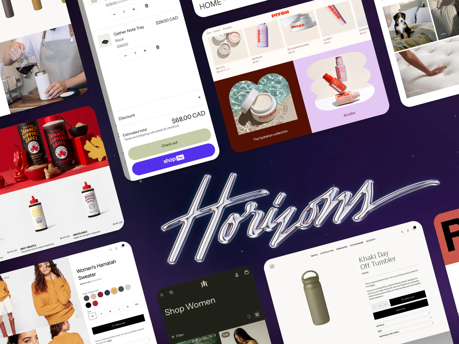
"Hasn't Shopify solved this with Horizon?" Partly. Block-first architecture brings more flexibility without code. AI-assisted section generation speeds work up. For a brand that fits within what Horizon offers out of the box, it's a great solution.
But Horizon doesn't change the fundamental constraint. The moment you add custom code to Horizon, you're back in the same update trap.
Horizon improved the starting point. It didn't solve the ceiling.
If you're building significant custom work on top of Horizon today, think about what happens when Shopify ships the next standard in 2027 or 2028.
Decision two: what kind of custom build do you need?
If you've concluded that a standard theme isn't enough anymore, two paths are on the table. The choice comes down to one thing: do you want a partner to take the technical lead, or does your team have a strong opinion about how the codebase should be structured?
Path 1: Custom theme on an established foundation. The starting point for most mid-market brands. A custom-coded, custom-designed Shopify theme built on a partner's accumulated foundation. Core logic is already in place. Typically design ~6–8 weeks, development 8–10 weeks.
Path 2: Enterprise custom with full control. For brands with an internal tech team and strong opinions on architecture. The right path if you want to go headless (Hydrogen) or want full freedom in the Liquid build.
The warning most agencies skip
The honest answer is binary. Either a standard theme covers your needs and you should use it the way Shopify intended. Or your needs have genuinely outgrown what a standard theme offers, and you should invest in a purpose-built foundation.
The dangerous middle is agencies who tell you a standard theme can be customized to fit whatever you need. We made those exact mistakes ourselves earlier on. You hit the wall. Sometimes in three months, sometimes in twelve. But the wall always comes.
And the one thing to remember underneath all the technical decisions: the theme serves the customer journey, not the other way around. If the journey is built properly, the theme can be simpler. If the journey is broken, no amount of custom code will save it.
Bonus: three prompts for evaluating your own theme
Most theme switches get justified on feel ("this looks dated") or assumption ("it would probably convert better if…"). A better way is to let an AI tool look at the current theme with cold eyes and tell you what's solid, what's not, and where the technical debt sits.
Three prompts below. Run them in Claude, ChatGPT, or any AI tool. The first two work best when you attach theme code or screenshots. The third works with just a URL when the tool can browse the web.
Prompt 1: Technical theme audit
Use this when you want to know how many months or years of debt sits on top of the theme, and how far it has drifted from Shopify's current standard. Upload the theme zip or paste key files (theme.liquid, layout files, the biggest sections, schema.json, package.json if you have one).
You are a senior Shopify developer doing a technical audit of a
client's existing Shopify theme.

Attached are files from our theme. Go through them and tell me:

1. What is the theme's base (Dawn, Debut, a premium theme, custom)?
   Identify the version and estimate how many generations behind
   Shopify's current standard (Horizon) it is.

2. How much custom code sits on top of the theme? Give a rough
   estimate as a percentage and as a euro-value of rebuild work
   if the theme had to be ported to Horizon tomorrow.

3. Which custom parts are
   a) well built and worth porting as-is,
   b) poorly built and should be rewritten,
   c) unnecessary and can be removed entirely?

4. Are there broken dependencies, deprecated API calls, outdated
   Liquid patterns, or security risks in the theme?

5. Give a concrete list of 5–10 items that are the biggest blockers
   to ever cleanly updating this theme again.

6. Finish with one sentence: "This theme should be
   [updated / partially rebuilt / replaced entirely], because ___."

Be blunt and concrete. No diplomatic hedging — I'm not the person
who built it, so feel free to say what's bad.
Prompt 2: Industry benchmark
Use this when you want to know how your theme stacks up against the best examples in your category. Provide your own URL and 5–10 competitor or industry-leading store URLs.
You are an experienced e-commerce strategist who has audited hundreds
of stores. Your job is to benchmark our store against the strongest
examples in the category.

Our store: [URL]

Comparison stores (same category or similar positioning):
- [URL 1]
- [URL 2]
- [URL 3]
- [URL 4]
- [URL 5]

Go through our store and each comparison store across the homepage,
collection page, product page, and checkout entry. Score each on:

1. Visual identity — how distinctive, professional, and brand-led
   does the store feel? Score 1–10 with reasoning.

2. PDP structure — how well does the page answer "why this", "why
   now", "why you"? Is add-to-cart above the fold on mobile?

3. Navigation and collection pages — do they help the customer find
   the right product, or force browsing?

4. Performance — overall impression of load speed and smoothness
   (mobile especially).

5. Mobile experience — is it a genuine mobile-first build or a
   compressed desktop view?

For each area, give:
- What we clearly do better than the comparison set
- What we clearly do worse
- The single change to our store that would deliver the biggest
  upside

Finish with a list of 3–5 concrete improvements that would put us in
the top tier of the category — prioritized by effort vs. likely
impact.

Avoid generic CRO clichés ("make sure key elements stand out"). Give
specific, store-level observations
Prompt 3: CRO and UX review of your own product page
Use this when you want to know whether the theme is suffocating conversion — and what can be said based on a single product page. Provide a URL and a few screenshots at different screen sizes (at minimum mobile and desktop).
You are an experienced UX strategist specializing in conversion
optimization. Your job is to evaluate this Shopify product page and
tell me what's helping the purchase and what's slowing it down.

Product page URL: [URL]
Attached: screenshots from mobile and desktop views.

Walk through the page from these angles:

1. The customer's first 5 seconds — on mobile, does the visitor
   immediately get an answer to: what is being sold, what does it
   look like, what does it cost, how do I add to cart?

2. Hierarchy mistakes — which elements steal attention out of
   proportion to what the visitor is trying to do?

3. Add-to-cart placement — is it above the fold on mobile? How
   does the sticky behavior work on scroll?

4. Information ordering — is the most important information
   (images, price, size, key benefits) before the buy button, or
   does the page force the visitor to scroll to find it?

5. Trust signals — reviews, returns, shipping, payment options.
   Are they placed where the visitor actually needs them, or just
   "somewhere down the page"?

6. Mobile experience separately — say directly whether this is
   built mobile-first or desktop-first. Justify the call.

Finish with:
- Three single changes likely to lift conversion most, without
  needing to replace the theme
- Three things the current theme likely prevents fixing without
  custom work — i.e., signals that the theme itself is the
  bottleneck

Avoid generic CRO jargon. Say things the way you would say them
to a client in a meeting
Once these three are run, you have a concrete picture of what shape the theme is in, where it should be heading, and what the biggest single bottleneck is. Only then can the question of an update vs. a rebuild be answered properly.
If you'd like to walk through the results together and figure out whether Brancoy growth services or a custom rebuild is the right next step, let's talk. Brancoy growth services combines auditing, data, and continuous development so growth is built systematically and measurably.